Published on January 24, 2024

Controlled and Uncontrolled React Components
#Coding#en-US
First, let's see how React defines Controlled and Uncontrolled Components on their documentation site.

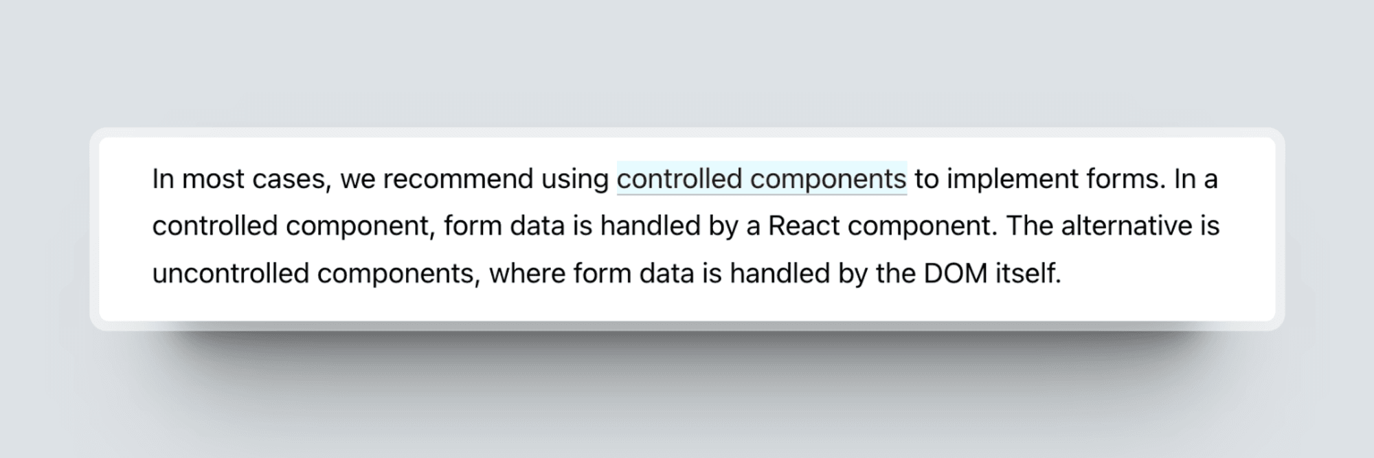
The recommendation for controlled components:
After reading these sections on the React Doc site, I found the definitions somewhat lacking in integrity and rigour. All these contents discuss form elements, but what about non-form components like Dialog and Carousel?
What does uncontrolled and controlled mean?
When we talk about controlled and uncontrolled components, what we are really referring to is the component state. It’s handled by the DOM or React state management mechanism.
To explain this idea, let's use the Accordion component as an example for comparison with form elements.
Uncontrolled Component
An uncontrolled component is a component where the component state is handled by the DOM.
1const AccordionItem = ({ summary, children }) => {
2  return (
3    <details>
4      <summary>{summary}</summary>
5      {children}
6    </details>
7  );
8};
9
10const Accordion = () => {
11  return (
12    <div>
13      <AccordionItem summary="Summary 1">Details 1</AccordionItem>
14      <AccordionItem summary="Summary 2">Summary 2</AccordionItem>
15    </div>
16  );
17};
We are not handling the state of Accordion items with React, this is done entirely by the DOM.
Now, let's examine the form element example:
1const NameForm = () => {
2  const inputRef = createRef();
3
4  const handleSubmit = (event) => {
5    alert('A name was submitted: ' + inputRef.current.value);
6    event.preventDefault();
7  }
8
9  return (
10    <form onSubmit={handleSubmit}>
11      <label>
12        Name:
13        <input type="text" ref={inputRef}/>
14      </label>
15      <input type="submit" value="Submit"/>
16    </form>
17  );
18}
In the Form component, it uses a ref to get the input value from the DOM.
Controlled Components
A controlled component is a component where the state is managed by React. The controlled state is often passed down to the controlled component via a prop from the parent component.
Let's update the above Accordion component to ensure that only one item is open at a time.
1const accordionItems = [
2  { id: 1, summary: 'Summary 1', details: 'Details 1' },
3  { id: 2, summary: 'Summary 2', details: 'Details 2' },
4];
5
6const AccordionItem = ({ summary, children, isOpen, onToggle }) => {
7  return (
8    <details
9      open={isOpen}
10      onClick={(e) => {
11        e.preventDefault();
12        onToggle();
13      }}
14    >
15      <summary>{summary}</summary>
16      {children}
17    </details>
18  );
19};
20
21const Accordion = () => {
22  const [openedItem, setOpenedItem] = useState(null);
23
24  return (
25    <div>
26      {accordionItems.map((item) => (
27        <AccordionItem
28          key={item.id}
29          summary={item.summary}
30          isOpen={openedItem === item.id}
31          onToggle={() =>
32            setOpenedItem(openedItem !== item.id ? item.id : null)
33          }
34        >
35          {item.details}
36        </AccordionItem>
37      ))}
38    </div>
39  );
40};
We've introduced two new props to the component to ensure it can control state from its parent.
How about the control from components?
1const NameForm = () => {
2  const [value, setValue] = useState('')
3
4  const handleChange = (event) => {
5    setValue(event.target.value);
6  }
7
8  const handleSubmit = (event) => {
9    alert('A name was submitted: ' + value);
10    event.preventDefault();
11  }
12
13  return (
14    <form onSubmit={handleSubmit}>
15      <label>
16        Name:
17        <input type="text" value={value} onChange={handleChange}/>
18      </label>
19      <input type="submit" value="Submit"/>
20    </form>
21  );
22}
With a controlled component, the input's value is always driven by the React state. This means you have to write a bit more code, but you can now pass the value to other UI elements or reset it from other event handlers. Compared to uncontrolled components, controlled components can provide the user with more customization capabilities, such as form validations.
Hybrid components
In the controlled Accordion component, it requires us to manage the open/closed state of accordion items every time we use it. However, sometimes, we just want to define the initial state and not worry about it afterwards.
It's time: hybrid components.
In order to support both controlled and uncontrolled states, we need to make the controlling props optional. This means that the AccordionItem needs to function whether we pass 'isOpened' and 'onToggle' to it or not.
1const AccordionItem = ({ children, summary, isOpen, onToggle }) => {
2  const handleClick = onToggle
3    ? (e) => {
4        e.preventDefault();
5        onToggle();
6      }
7    : undefined;
8
9  const open = typeof isOpen !== 'undefined' ? isOpen : undefined;
10
11  return (
12    <details open={open} onClick={handleClick}>
13      <summary>{summary}</summary>
14      {children}
15    </details>
16  );
17};
In this implementation, AccordionItem is controlled by default. However, once it receives props, it becomes a controlled component. We can also manage the state in the parent. Ensuring there is a single source of truth for the component state is crucial.
1import { useState } from 'react';
2
3const accordionItems = [
4  { id: 1, summary: 'Summary 1', details: 'Details 1' },
5  { id: 2, summary: 'Summary 2', details: 'Details 2' },
6];
7
8const Accordion = () => {
9  const [openedItem, setOpenedItem] = useState(null);
10
11  return (
12    <div>
13      {accordionItems.map((item) => (
14        <AccordionItem
15          key={item.id}
16          summary={item.summary}
17          isOpen={openedItem === item.id}
18          onToggle={() =>
19            setOpenedItem(openedItem !== item.id ? item.id : null)
20          }
21        >
22          {item.details}
23        </AccordionItem>
24      ))}
25      <AccordionItem
26        summary={'Summary of uncontrolled accordion item'}
27        isOpen={true}
28      >
29        Uncontrolled accordion item
30      </AccordionItem>
31    </div>
32  );
33};
Currently, the uncontrolled item is not influenced by the state management mechanism used for the other accordion items. Despite this, it expands and collapses as anticipated, and we can even set its initial state if necessary.
Conclusion
What determines whether a component is controlled or uncontrolled? The answer lies in whether the component is managed by the React state management mechanism or the DOM. The type of component is irrelevant; it's more about understanding the 'control' of the React state.
You can check out https://www.radix-ui.com/, where you will find that many components can be controlled or uncontrolled. Here is a partial list for your reference:
- Accordion
- Alert Dialog
- Checkbox
- Collapsible
- Dialog
- Dropdown Menu
- Menu Bar
- Navigation Menu
- …